Planning Corporate Events Professionally: The Underestimated Details Behind a Strong Brand Presence
Published on June 30, 2026
 AI-generated
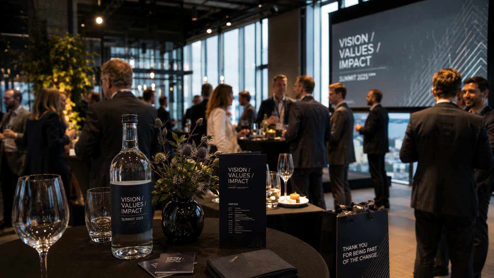
Those who plan corporate events professionally determine brand presence not in the main programme, but at the small touchpoints: at the reception desk, on the name badge, on the glass in hand, and in the gift that guests take home after the event. The keynote, venue, and catering typically receive the greatest share of budget attention, yet memories are often created elsewhere. Even small details such as individually designed Kern labels on bottles or give-aways can make the difference between a forgettable occasion and a distinctive brand appearance. These touchpoints are not an afterthought – they are part of the brand experience.
 AI-generated
Brand presence begins before the entrance
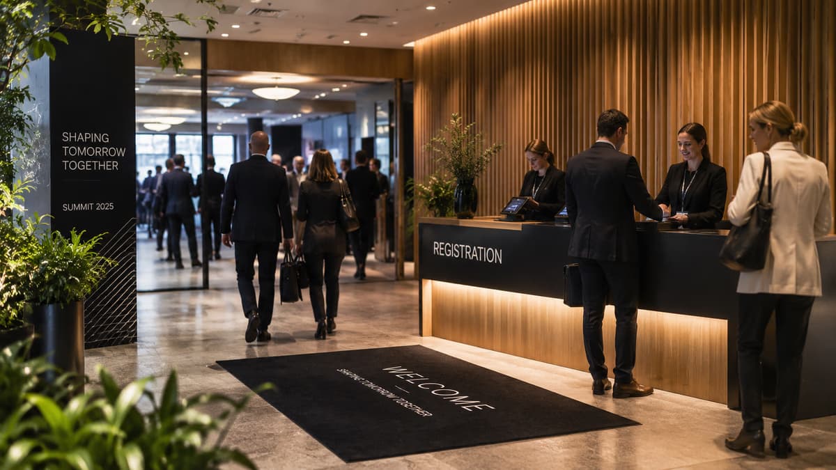
The first impressions of an event shape how attendees perceive the rest of the day. Signage in the outdoor area, welcome branding in the foyer, and consistently designed accreditation materials send a clear signal: nothing has been left to chance. Visual consistency between the invitation, on-site materials, and digital touchpoints such as the event app is essential. Inconsistencies in colour palette, typography, or logo usage appear amateurish and are frequently noticed by guests, even if they cannot explicitly identify them.
A practical anchor for your planning is a brief touchpoint list for each event phase: arrival, registration, breaks, main programme, evening segment, and farewell. For each phase, note which physical and digital elements are visible and who is responsible for them. This results in fewer last-minute print jobs and fewer branding gaps.
Visitor guidance as an invisible discipline
Good visitor guidance is often only noticed when it is absent. Signage should be legible at eye level, function in the main circulation routes of the venue, and clearly reflect language conventions – particularly in multilingual Switzerland. It has proven worthwhile to walk the wayfinding route from a guest's perspective before setup and to equip key decision points such as the cloakroom, facilities, main hall, and networking area with their own markers. Those who consider conference materials as well as table and door signage as a cohesive whole avoid stylistic inconsistencies between professionally printed banners and improvised A4 printouts.
Consistent event communication across all channels
Event communication encompasses far more than the save-the-date. It extends from the initial invitation through the briefing of service staff to the post-event follow-up by email. A concise communication set covering tone of voice, key messages, and visual language helps all parties involved – including external suppliers such as catering, technical, and hospitality staff. Three points are worthwhile in every briefing: What should guests say about the event afterwards? Which three words describe the brand appearance? What are the no-gos in visual communication?
The underestimated details: labels, give-aways, catering signage
As soon as a glass of mineral water in a generic PET bottle appears at the lectern, the brand presentation breaks down at a visible point. Individually designed labels on water bottles, wine, or signature drinks close this gap. A Swiss label manufacturer produces such labels in various print runs and supports you from initial consultation through material selection to delivery – including guidance on practical considerations such as condensation, refrigeration, and adhesive surfaces, which are often underestimated when it comes to event beverages.
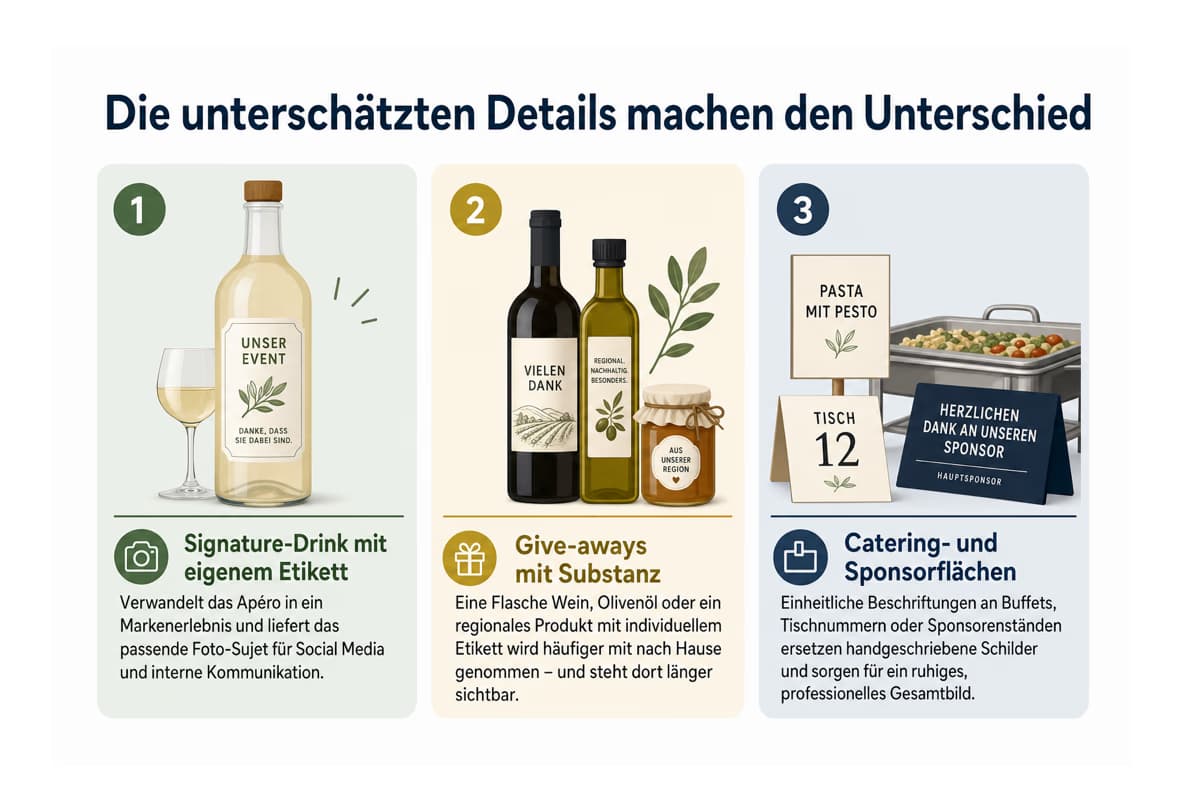
Three areas of application are particularly effective:
Signature drink with a custom label: A small print run of personalised bottles can transform the apéro into a brand experience and simultaneously provides an ideal photo subject for social media and internal communications.
Give-aways with substance: A bottle of wine, olive oil, or a regional product with a custom label tends to remain present in guests' everyday lives far longer than conventional promotional items.
Catering and sponsor surfaces: Consistent labelling at buffets, table numbers, or sponsor stands replaces handwritten signs and creates a calm, professional overall impression.
When it comes to design, the principle is: form follows function. Legible font size from table distance, logo no larger than necessary, clear hierarchy between product name, event, and brand element. For beverages containing alcohol or other ingredients, food labelling regulations must be observed – particularly when products are distributed beyond the company itself. Those who opt for sustainable label materials from the outset can additionally incorporate this aspect into their brand communications.
 AI-generated
Planning ahead rather than reaching for the glue gun
Personalised print products require lead time. Those who build the production time between final print approval and delivery firmly into the project plan, and align labels early with the invitations, avoid express surcharges and design compromises. A sample order in advance can protect against surprises regarding colour accuracy and adhesive behaviour – particularly with chilled bottles, waxed surfaces, or recycled materials.
After the event, brand work continues
The last underestimated touchpoint lies in the follow-up. A brief thank-you message with images in a consistent look, a recap video, and a list of promised materials complete the circle. Those who regard event branding not as decoration but as a unifying thread running through all phases build a recognisable brand with every occasion – and achieve greater impact with less effort.